


Our editor, Jane Arthur, looks into what goes into designing a picture book, and talks with the illustrator and designer of the new release from Huia Publishers, The Bomb|Te Pohū, written by Sacha Cotter.
Usually, the cover of a picture book boasts two names: that of the author and the illustrator. Because a picture book is made up of two things – the words and the pictures. Right?
Well, not entirely.
There’s a third element, and it’s the thread holding everything together: design. The best picture book design is invisible – when done right, it lets the words and pictures have the spotlight, with nothing clunky or out-of-place. It is integral to making a book with a cohesive visual rhythm, pacing that surprises or reassures in all the right places, a balance of white space and full-page images (or not). A well-designed book has a font that is readable and has the right ‘character’ for the story, paper stock that feels nice and shows colours true to the illustrator’s vision, and a cover that makes you pick up the book and want to look inside.
The best picture book design is invisible – when done right, it lets the words and pictures have the spotlight…
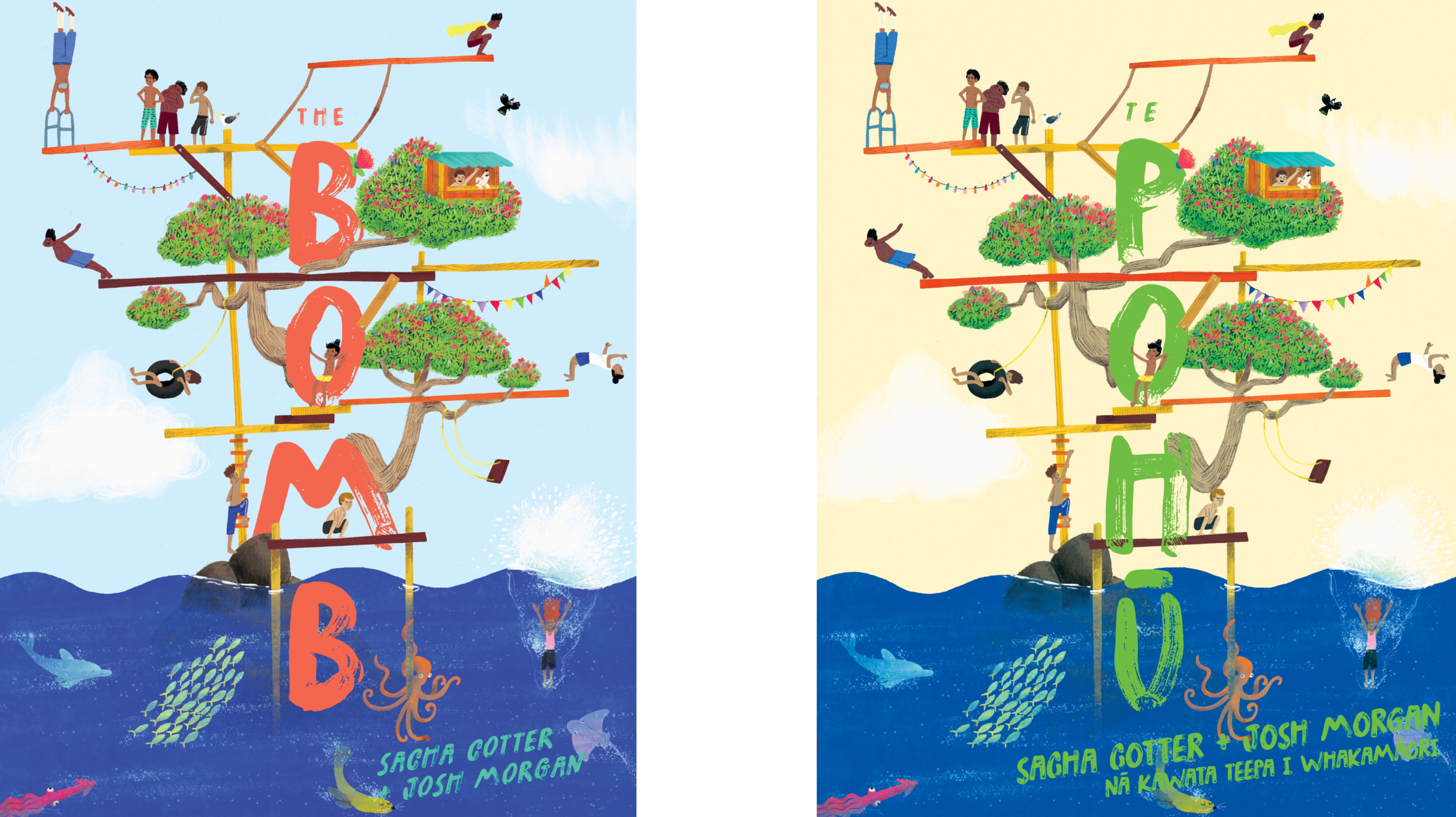
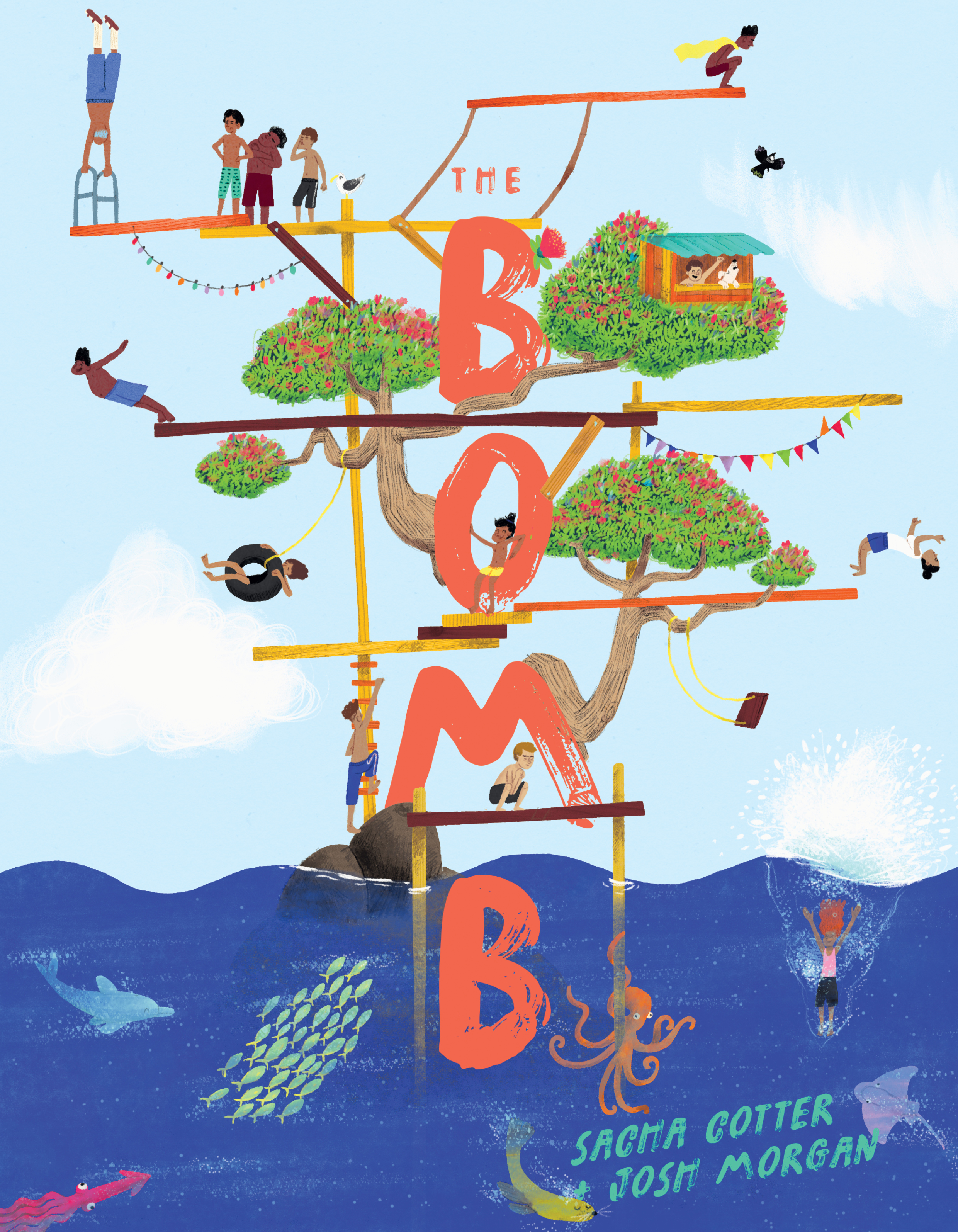
The team at Huia Publishers have agreed to let their new book, The Bomb, demonstrate the various processes and considerations that go into making a successfully designed picture book. The Bomb is written by Sacha Cotter, illustrated by Josh Morgan (Te Aitangā-a-Māhaki, Rongowhakaata) and designed by Huia’s Design Manager, Te Kani Price (Tūwharetoa, Whakatohea). It is available in a Te Reo Māori edition, too, called Te Pohū. It’s a colourful, incredibly endearing tale of a boy who wants so badly to be the best at ‘bombs’ (you know, making a massive splash in the water), but his self-confidence isn’t where it needs to be – yet.
The roles of ‘illustrator’ and ‘designer’ can be blurred at times. Who decides what goes where on each page? Who decides what goes in and what’s left out?
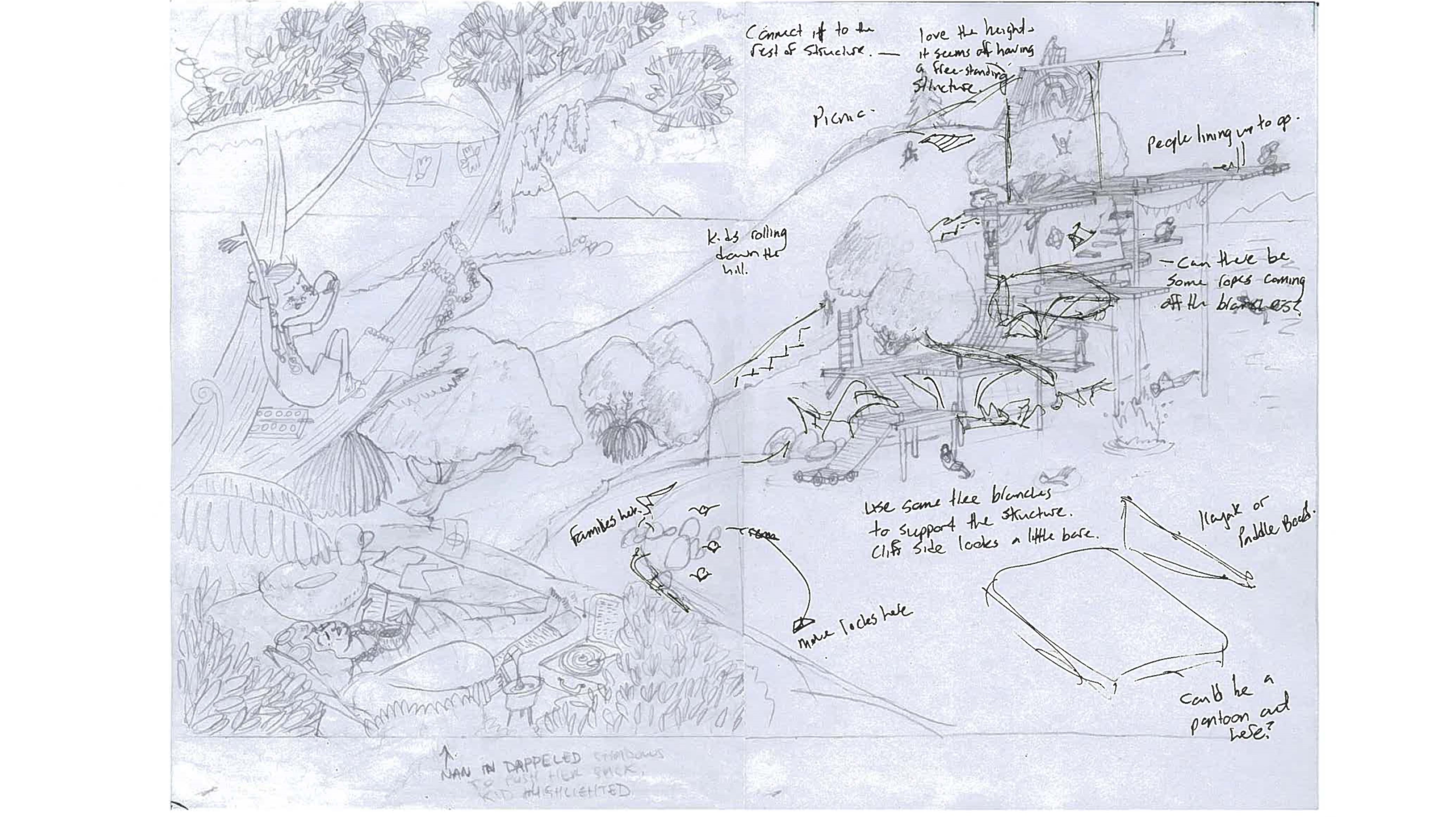
Sometimes, the designer might guide the illustrator from the start, suggesting layouts and ideas for what elements of the story to illustrate. That is what happened with some of Josh and Sacha’s previous books (which include Keys|Ngā Kī and The Marble-Maker|Te Kaihanga Māpere). Josh explains that with those books, ‘Huia provided some suggestions as to what the illustrations could be, and which I could launch off from.’
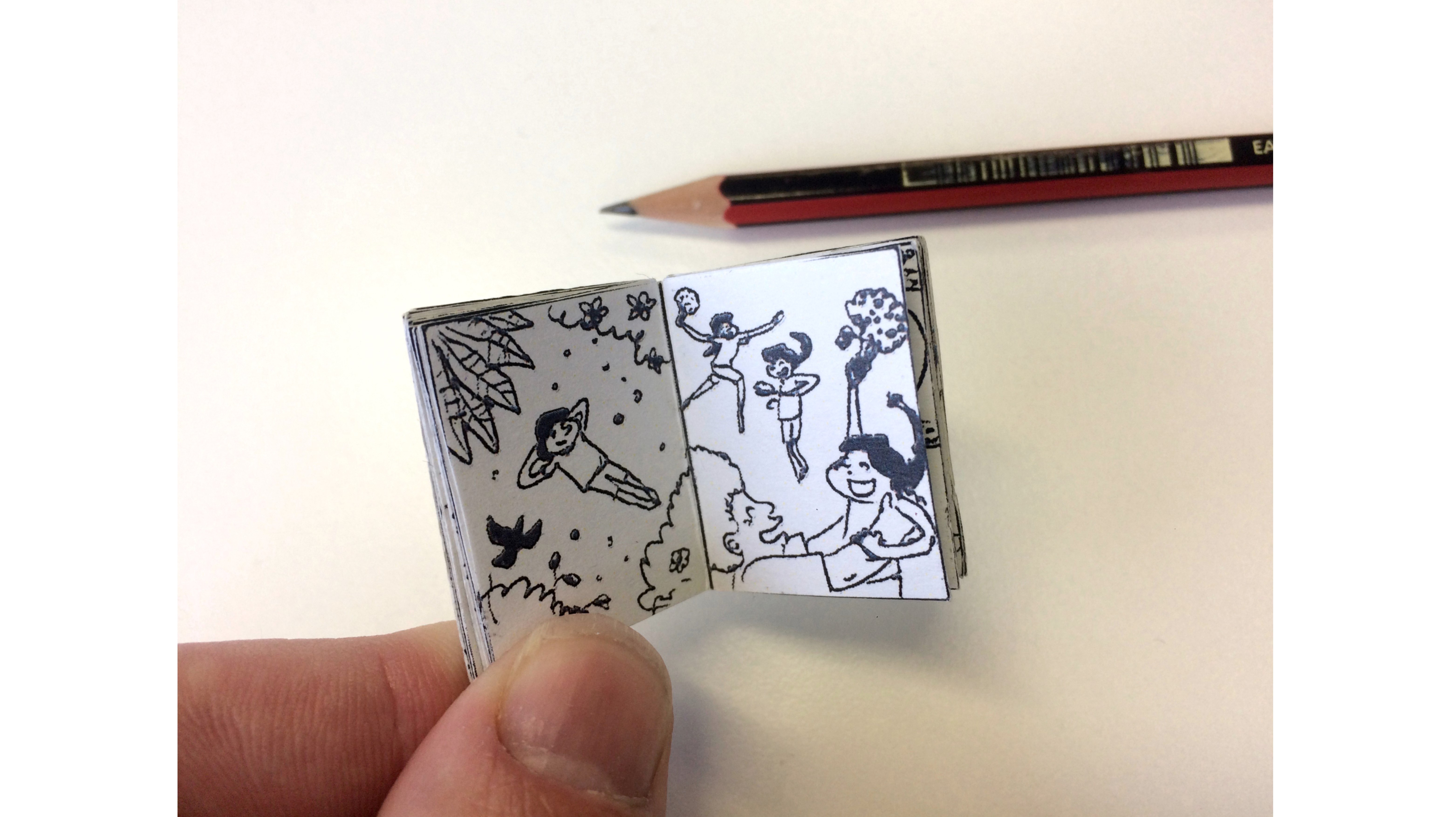
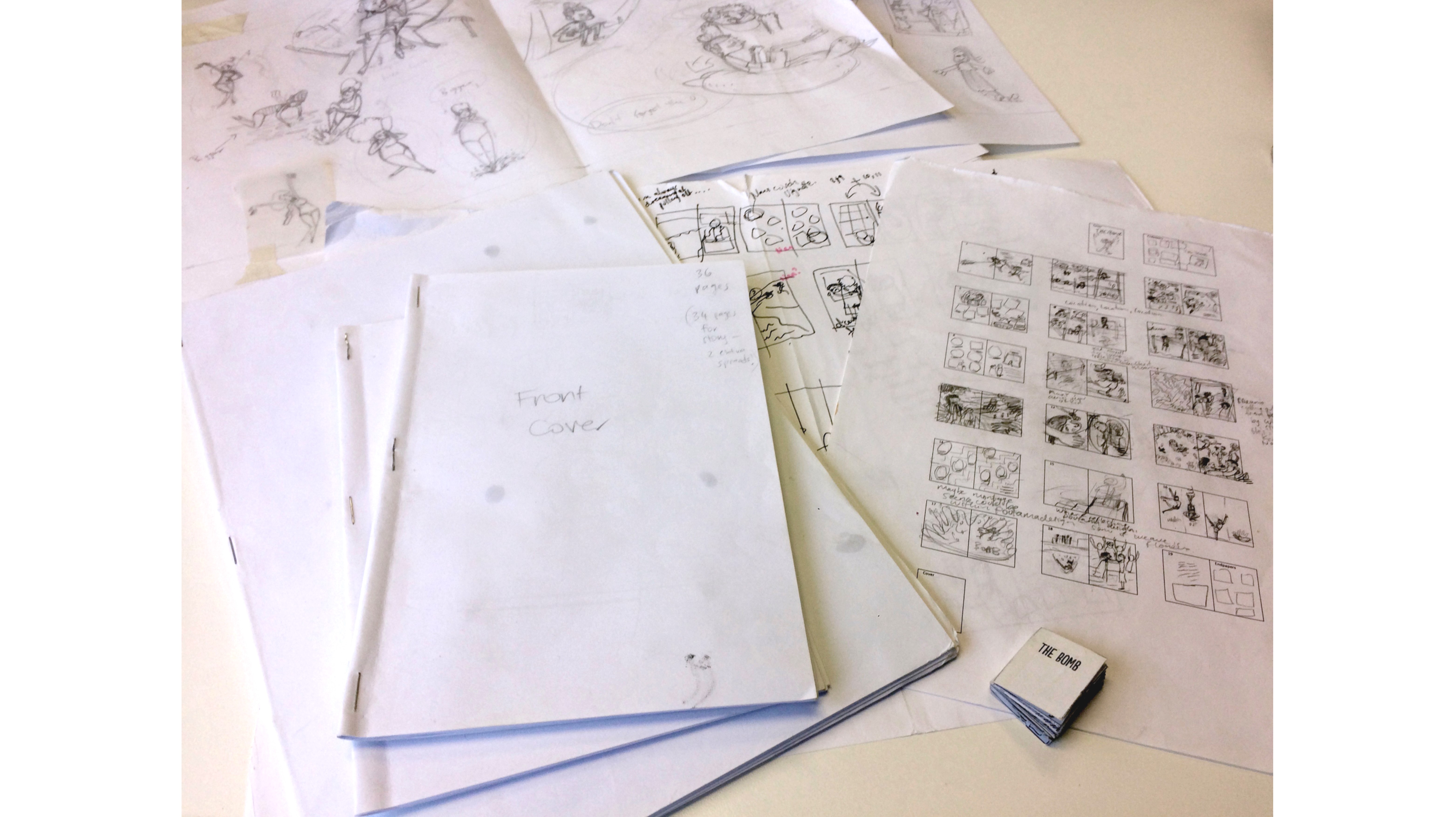
But The Bomb was different. ‘This time around, soon after Sacha wrote the first draft of the story, she and I started to work on some rough thumbnails and even created a ridiculously mini book dummy (don’t know what I was thinking). The image shows how ridiculously small the book is! It did help give an idea of the flow of the book.’
From here, the team at Huia gave feedback, which in turn lead to more brainstorming of ideas. ‘This is where the idea for the equations written across the page came about and the iconic image of the kid smearing the “war paint” like Rambo. I think some wonderful moments came about from everyone riffing and sharing their vision!’ says Josh. Designer Te Kani agrees that the process works best when it is collaborative.
‘I think some wonderful moments came about from everyone riffing and sharing their vision!’ says Josh.
One of the most important qualities of a picture book is that of its pacing. Think about Hairy Maclary from Donaldson’s Dairy, and the tension created by the pause in the page-turn at ‘when suddenly out of the shadows they saw …’ Boo! Picture book design can be pretty emotionally manipulative – in the best way, of course. Pacing creates emotion, rhythm and intrigue. It’s managed by things like timing of page-turns, the use of white (or empty) space on the page, and the use of compositional order and grids (and breaking rules).
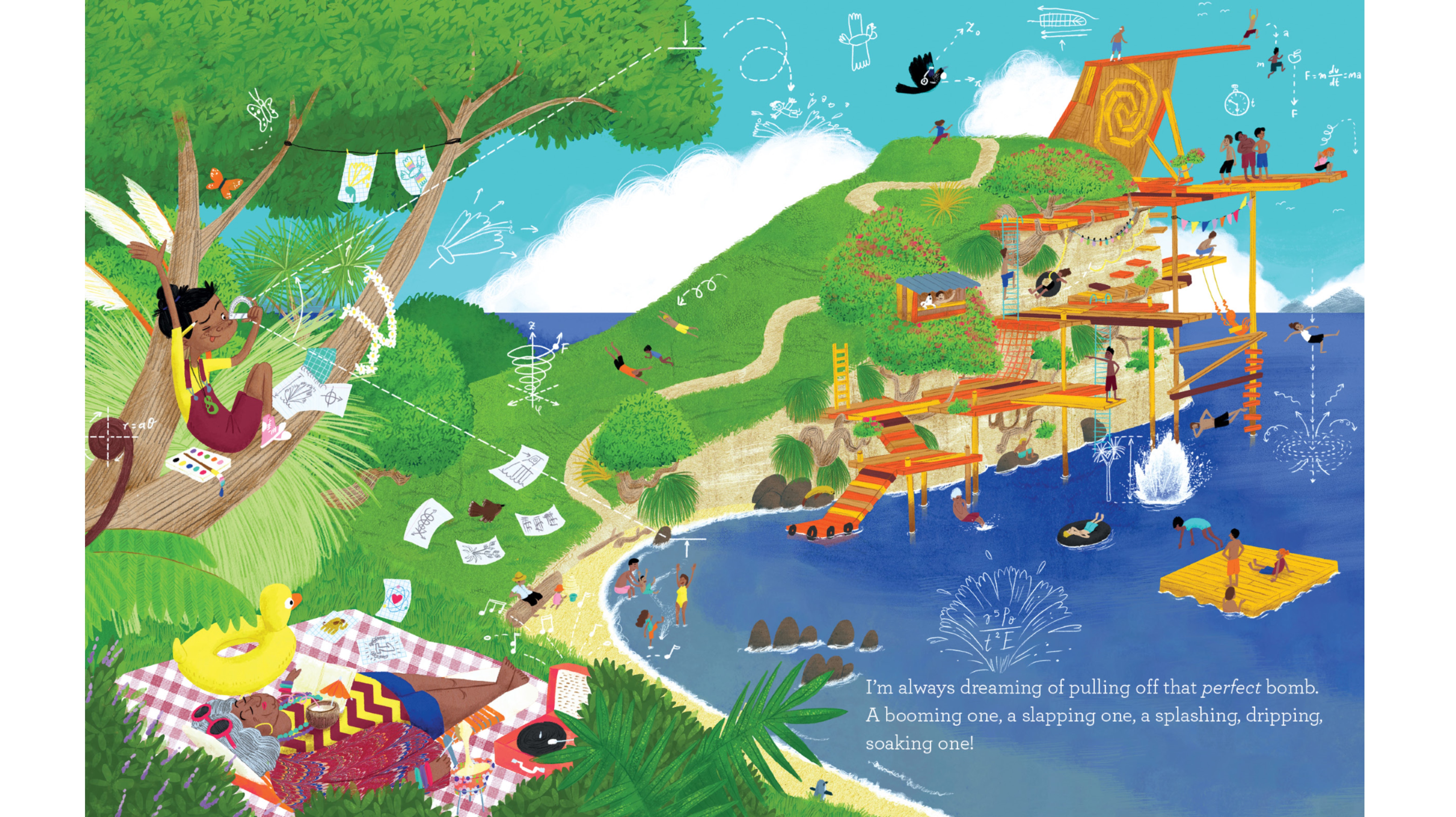
The Bomb has an assortment of full-bleed/full-spread, vignettes with and without background, close-ups and long-shots, pages that act almost like comic strips… The whole package is done so well that the reader probably won’t notice any of it, because they’ll be so swept up in reading the story (and pictures).
With The Bomb, Josh explains that considerations of ‘balance, contrast and cohesion’ were important right from the start. ‘Structurally, I tried to break the spreads down into little segments or “scenes” where the spreads go from full pages down to vignettes, or vice versa, building in the opposite way. It was important the next page didn’t look like the last page.’
It’s an energetic, fun and funny story full of personality, so Josh knew the visuals had to match. ‘We did want a lot of variety, and for the book to feel idiosyncratic.’
One way the team achieved this was to take inspiration from books and films. One example, says Josh, is ‘the town scene with the little truck driving around, and scenes with little spot illustrations of characters, [which] are very Wes Anderson.’ A number of the visual elements and layouts in the book pay homage to ‘the idiosyncratic, humorous yet sincere films of Anderson, Taika Waititi, Aardman and Laika Studios, amongst others,’ Josh reveals.
Sometimes, despite dozens of good ideas or wonderful illustrations, things need to be pared back or focussed for the betterment of the final product. Te Kani sums it up by saying, ‘What’s kept in basically comes down to: does it support the narrative in some way or does it help strengthen the overall tone of the story?’
Josh admits that some things didn’t make The Bomb’s final cut: ‘There were a few things that didn’t make it, such as Nan’s house. This would have been a setting change too many.’ Te Kani explains that they found a way to evoke Nan’s character in other ways. ‘Taking the reader out of the setting at the water took them out of the story a little bit. We’d already fleshed Nan out in the prologue/endpapers/prelim story.’
There’s often a way for good designers and illustrators to squeeze in lots of visual detail … without detracting or distracting from the narrative.
There’s often a way for good designers and illustrators to squeeze in lots of visual detail, though, without detracting or distracting from the narrative. Te Kani praises Josh’s talent at creating ‘quirky details and little subplots in the backgrounds. There’s a whole layer of treasures hidden in the illustrations, like the octopus that gets up to a whole lot of mischief, or the logging truck and dried flowers, which are an ode to Sacha’s truck driving nan.’ In fact, The Bomb was expanded from a picture book’s usual 32 pages to 36, to allow extra space to fully tell the story through the illustrations.
Another of Josh’s specific talents is evident in the way The Bomb shows a unique, authentic side of Aotearoa in both the story and the illustrations. Te Kani inspires a closer look of the book by noting, ‘With all of our illustrated books, Huia looks to highlight Aotearoa, its uniqueness and how we see ourselves as Māori. This translates to a lot of the details and mannerisms that Josh has been able to visualise.’
One important and very tricksy part of a physical book, and one that is too often overlooked, is the gutter. It’s where the pages meet in the middle of the spread, and whole sections of illustrations are sucked into its black void… Grab some picture books off your shelf and take a look at how they’ve designed the layout around the gutter – and you’ll see that sometimes it’s more successful than others.
The Bomb’s team were very aware of the pitfalls and quirks of the gutter.
The Bomb’s team were very aware of the pitfalls and quirks of the gutter. Josh admits, ‘Sometimes I am shocked at how much can be sucked into the gutter black hole!’ Te Kani says the biggest gutter-related challenge comes when designing a full-page spread with illustrations that cross the centre line, and that the trick is in ‘having enough detail that can visually connect the two pages, but none of the essential elements go too close to that void.’ A tip from Josh: ‘A general rule of thumb is to try not to have any of the characters go through the gutter. The scene of Nan driving the kid around was one where I had to really consider how the truck would work in across the gutter making sure no details were lost in the centre.’
Beyond the gutter, there are heaps of decisions to make about the book’s physical properties. What size and shape – small and skinny, or big and square? What type of paper – uncoated and natural-feeling (lovely, but it sucks the brightness out of colours), or shiny (makes colours ‘pop’ but can look lower quality)? A paperback or a hardcover? Fancy extras on the cover, like glossy laminate on the title, or embossing, or shiny foil bits, or straight matt-laminate all over? ‘Size, format and finishing comes down to the overall desired effect that best serves the story, fits the budget and market requirements,’ explains Te Kani.
Ultimately, all of this work, collaboration and attention to detail have at its heart one goal: to tell a good story. The design and illustration and, in the case of The Bomb, even the text, will evolve and work together to make the story really shine.
THE BOMB
By Sacha Cotter
Illustrated by Josh Morgan
Published by Huia Publishers
RRP: $23.00

Jane Arthur
Jane Arthur co-owns and manages GOOD BOOKS, a small independent bookshop in Pōneke Wellington. She twice judged the NZ Book Awards for Children and Young Adults, in 2019 and 2020. Her debut poetry collection, Craven (VUP) won the Jessie Mackay Prize for best first book of poetry at the 2020 Ockham NZ Book Awards, and her second collection, Calamities!(THWUP) was longlisted for the Mary and Peter Biggs Award for Poetry in the 2024 Ockham Awards. Her debut children's book, Brown Bird(PRH) is due for release in May 2024. Jane is also co-founder of The Sapling.