


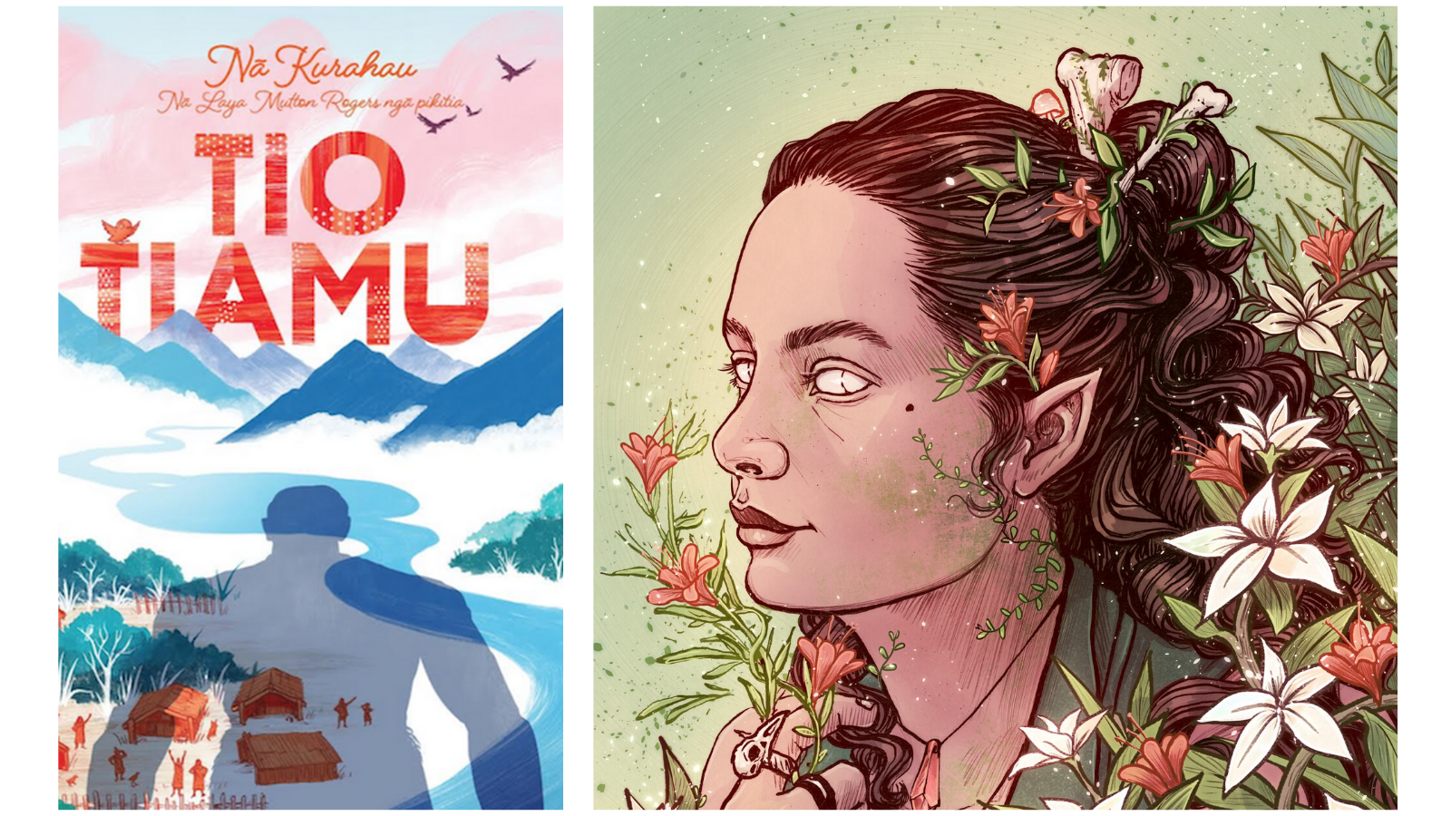
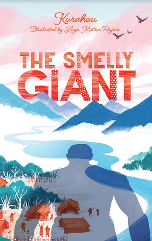
One of the most exciting new artists to pop up on our radar in the last six months has been Laya Mutton-Rogers, the artist behind the beautiful illustrations in Tio Tiamu | The Smelly Giant, released late last year by Huia. Laya talks us through her process of illustrating the book, bringing together traditional techniques and digital processes.
Day-to-day Creating
I don’t really have a typical schedule, it depends on what I’m working on! Sometimes I’m working on a big project like a picture book, sometimes a bunch of smaller projects like book covers or personal commissions. Often I’m just doing a combination of original and fan art, both for myself and sharing online, and also selling at conventions and zinefests.
I work out of my room in my flat (I finished uni in 2018, and having only been freelancing in the last year it still feels a bit like I’m a student – but without the studying part), usually listening to podcasts or audiobooks while I work. I recently bought an iPad Pro, however, which means I can work pretty much anywhere – it’s great to be able to get out and work outside a lot more instead of spending all day inside. When I was working on Tio Tiamu I just used my old Wacom tablet – as well as paper and ink, of course! While I work mainly digitally, I still love using traditional media and the texture and imperfections it brings.
Connecting with Huia
Huia found me via the graduate exhibition at Massey, where my display was the webcomic I made for my honours year major project. I worked on a smaller project with them earlier in the year and was excited to be asked to work on a picture book after that! I’m working on another picture book with Huia at the moment, too; quite different from Tio Tiamu but just as interesting to work on. I’ve also been doing a few book covers recently, which I really enjoy.
Working on Tio Tiamu
My illustrations for Tio Tiamu aren’t exactly in the style of my usual art, aside from the mixture of traditional and digital, and the use of bright colours. I was definitely keen to explore the use of white space and vignette illustrations, two things that were mentioned in the brief.
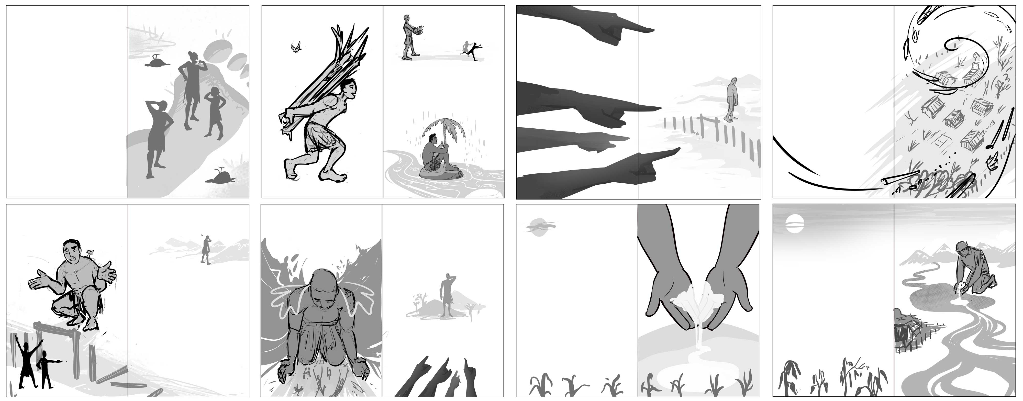
I started off by going through the script doing the most basic thumbnails in a sketchbook – more about taking notes for myself than anything else, and having a physical version of the page layout and whole storyboard. I generally write bullet point notes next to each page, either from the brief, or my own thoughts or notes to myself. I tend to come back to these notes at various points through the process, because sometimes little details get forgotten when you’re working on 40 pages. At the same time I was doing a bunch of research: from art styles and colours, to references for the kinds of things I’m going to be drawing.
Developing Characters and Storyboards
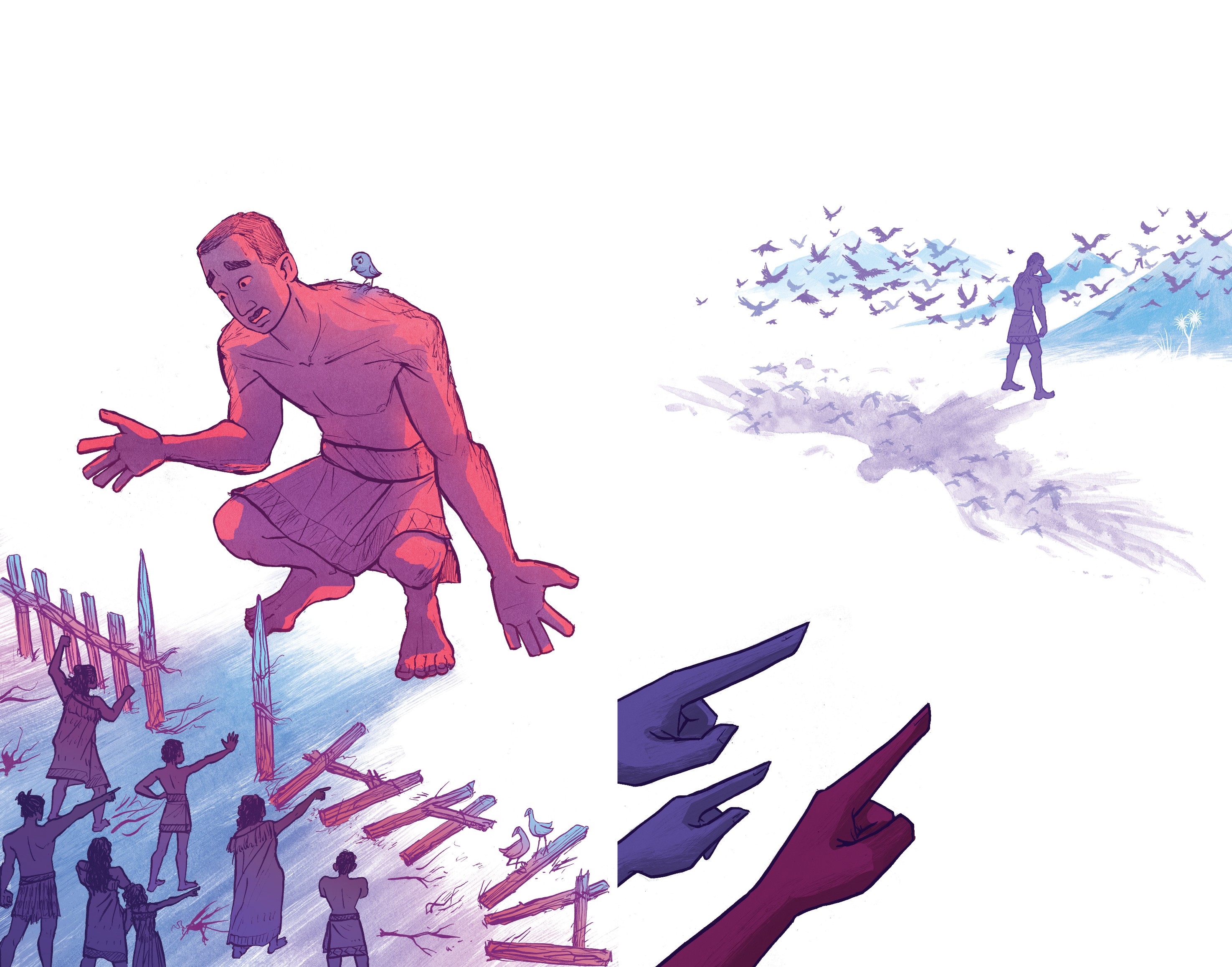
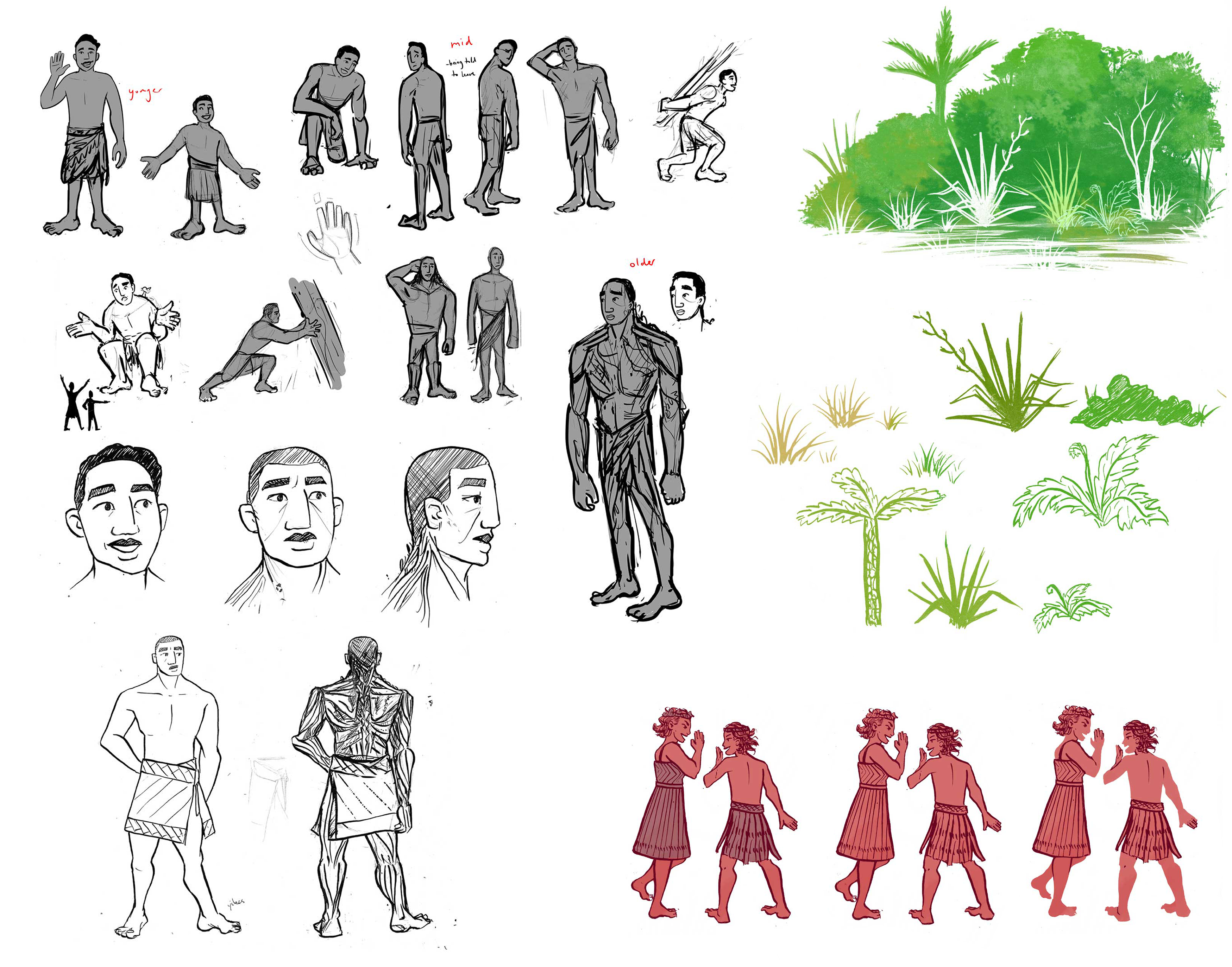
Then I started on character designs. Having the basic storyboard in my head helps with knowing what I need to take into account with the character design – especially when the character is going through a transformation, like Tio does. I also did a bit of style testing, to demonstrate the sort of thing I was thinking for the final version, since it’s not exactly like my normal work. I kept the character designs rough as I hadn’t fully developed the style, specifically. Initially, I wasn’t sure how much would be lined and how much would just be silhouetted shapes.
Next, I did the main storyboard thumbnails. I always do this digitally, as it’s easier for blocking out shapes and using different grayscale tones for clarity. I sketch in more detail if it’s relevant, like expressions, though I try to portray as much as possible in just the body language. I tend to send off a couple of each page, that emphasise slightly different things in the storytelling for the client to decide what they like best. Some pages stay almost exactly the same compositionally, some end up changing a lot!
Once I got feedback on those, I did more detailed digital versions – getting all the placement and details right, though not worrying so much about keeping it neat, since I’m going to be inking it on paper anyway. I used Clip Studio Paint’s 3D models for easy adjustment of character poses – for the villagers, mainly, since there are quite a few crowd scenes, and it’s a great tool for quick compositional arrangements.
Letting the Ink Dry
Then I got down to inking! I traced everything into an A3 sketchbook and started inking it in detail. I used a dip pen and Indian ink for lines (with fine liners for small details) and big brushes for textured sections. Even some of the white elements (like the clouds and lava) I did in black ink because I’d be reversing the colour digitally.
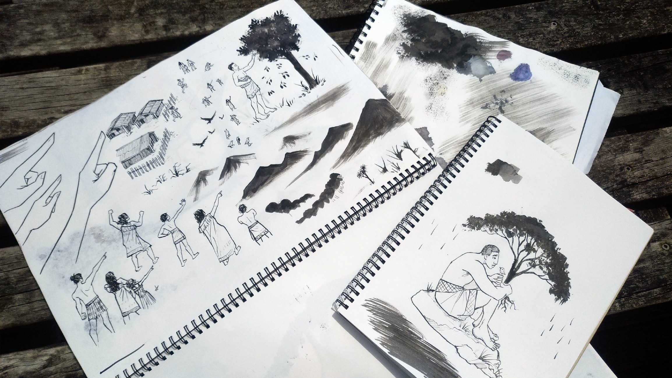
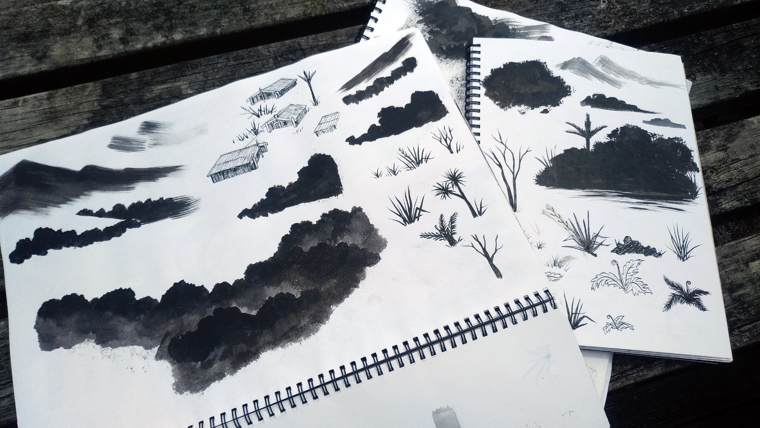
I inked all the elements separately, fitting as much as I could onto the page as to not waste paper. This meant that once scanned, separated, and made transparent, I could continue to arrange and adjust all the elements as separate layers, and change their colours with a keystroke. This is really handy when working with a client as opposed to personal work, because I could easily adjust and change things based on feedback, rather than having to redraw things if they need a change.
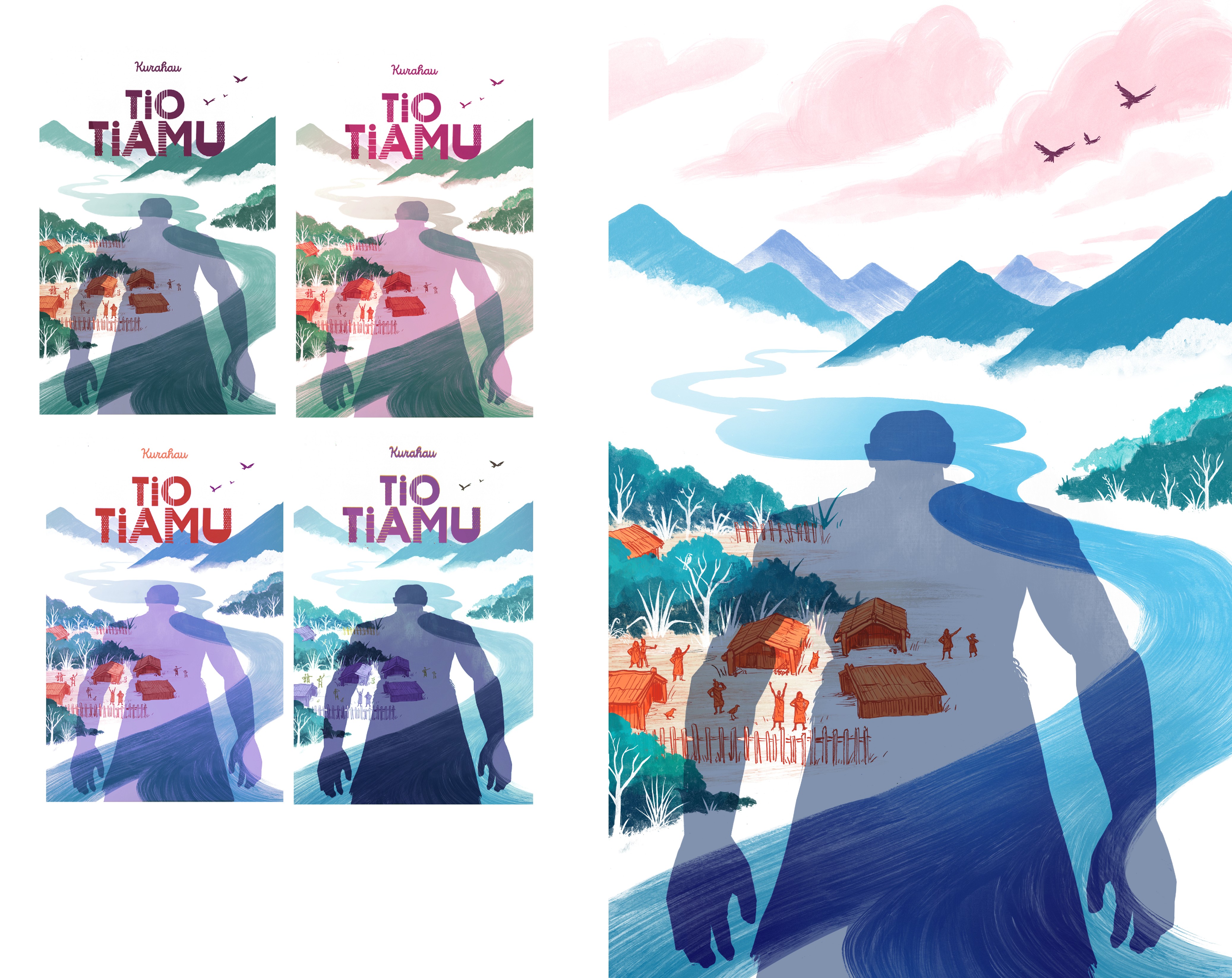
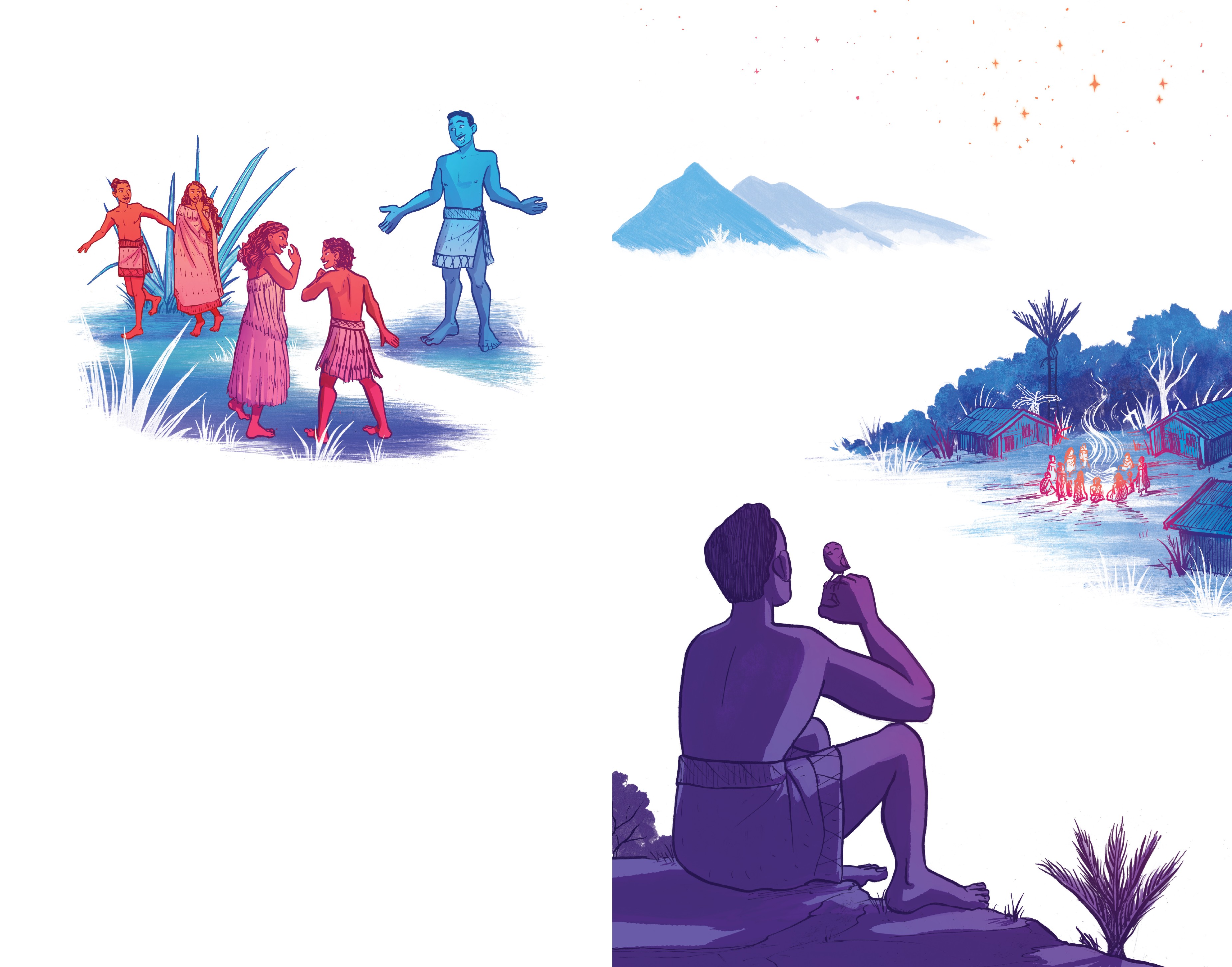
From there, I arranged everything on the pages and started on colours and adding in final details.
The colours are bright and unnatural, more about representing the feeling and emotion of the story than everything being the ‘correct’ colour. I started by roughly colouring over all the thumbnails together, to get an idea of the overall colour of the narrative. I had an approximate idea of the colours for most pages, but there were some that went through a few iterations before we came to the final version.
From there, it was all put together by the designer (Te Kani Price) and sent off to be printed – and the result is what you can see in bookshops and libraries across Aotearoa!
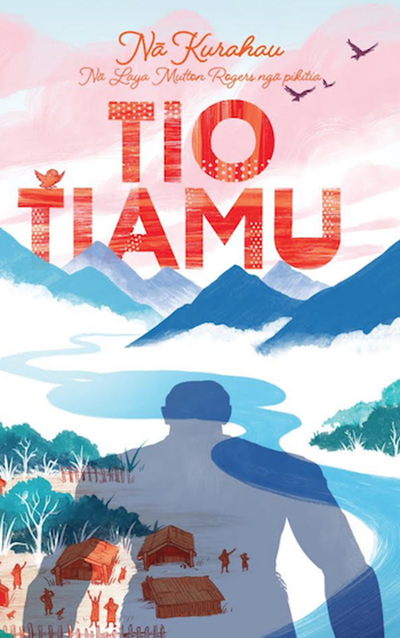
Tio Tiamu
Nā Kurahau i tuhi
Nā Laya Mutton-Rogers ngā pikitia i tā
Huia Publishing
RRP $25
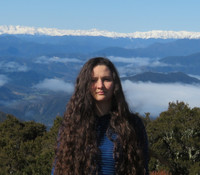
Laya Mutton-Rogers
Laya (Rose) Mutton-Rogers is an illustrator & designer from Nelson who currently lives in Wellington.
She loves fantasy and nature and works in both traditional and digital mediums. Her interactive/animated webcomic Overgrown, which was her university honors project, can be read at overgrowncomic.com
You can find the rest of her work at layaroseart.com.